Display

When building workflows, you have two main properties for displaying results:

return {
  display: string | array,
  workflow_display: string | array,
};
  • display: The primary property for showing the results UI everywhere including workflow, rules, and record contexts
  • workflow_display: The property for showing the results UI only in the workflow context

How to Return Display Properties

Display properties are typically returned in a code step, usually the last step of your workflow. And the UI will be rendered in this code step’s output section.

return {
  display: `# Analysis Results\n\nThe analysis is complete with a ${util.formatNumber(modelStep.output.message.confidence_score, { style: 'percent' })} confidence score.`,
};

Display Formats

All display properties support two main formats:

Markdown

Use markdown for rich text formatting:

return {
  display: `
# Analysis Results 📊

## Key Findings
- Revenue: ${util.formatCurrency(modelStep.output.message.revenue)}
- Growth: ${modelStep.output.message.growth_percentage}%

## Details
${modelStep.output.message.analysis}
  `,
};

Structured Display

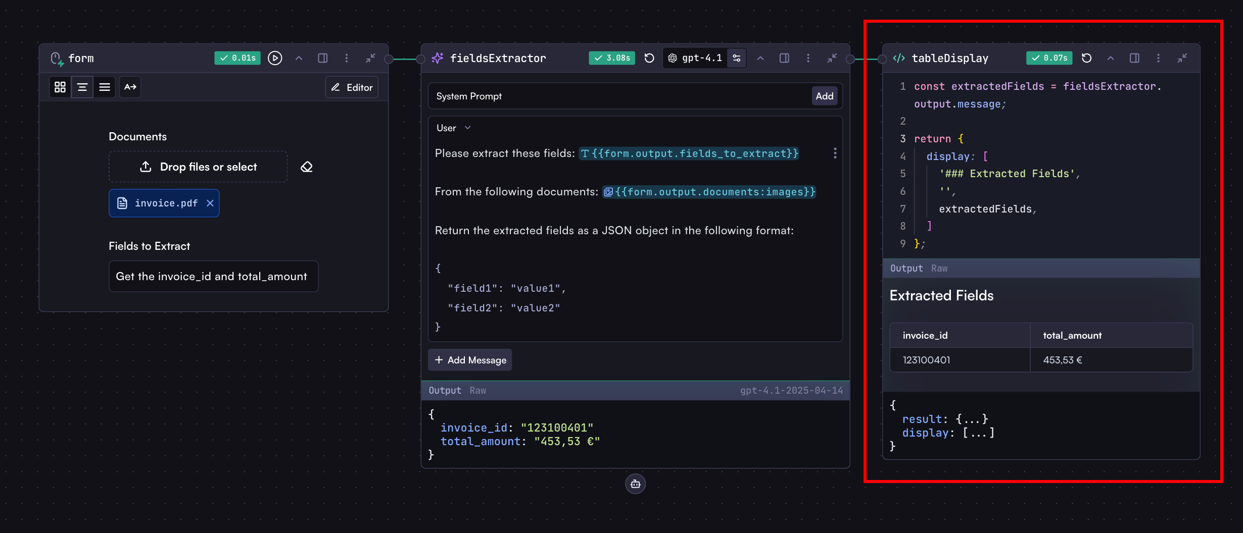
For more complex layouts, use arrays and objects that Cortex will render as beautiful, readable UI content:

return {
  display: [
    // Content follows
    '# Financial Report',
    'Generated on: ' + new Date().toISOString(),

    // More sections can follow, each with optional config
    [{ $variant: 'info' }, '## Revenue Breakdown'],
  ],
};

Tables in Structured Display

Tables can be created in two ways:

  1. Single Row Table: Add an object directly to the display array:
return {
  display: [
    '# Performance Metrics',
    '',
    'Monthly Overview:',

    // Single row table
    {
      Metric: 'Value',
      Revenue: util.formatCurrency(modelStep.output.message.revenue),
      Growth: modelStep.output.message.growth + '%',
      Status: modelStep.output.message.status,
    },
  ],
};
  1. Multi-Row Table: Wrap multiple row objects in an array:
return {
  display: [
    '# Performance Metrics',
    '',
    'Monthly Overview:',

    // Multi-row table
    [
      // Row 1
      {
        Month: 'January',
        Revenue: util.formatCurrency(1000000),
        Growth: '15%',
        Status: 'On Track',
      },
      // Row 2
      {
        Month: 'February',
        Revenue: util.formatCurrency(1200000),
        Growth: '20%',
        Status: 'Exceeding',
      },
    ],
  ],
};

Display Configuration

In structured displays, any nested array can include a configuration object as its first element:

return {
  display: [
    // Section with success variant
    [{ $variant: 'success' }, '# Successful Analysis', 'All tests passed'],

    // Section with warning variant
    [
      { $variant: 'warning' },
      '# Attention Required',
      'Some metrics need review',
    ],

    // Section without config (optional)
    ['# Regular Section', 'No special styling'],
  ],
};

Mermaid Diagrams

Cortex supports Mermaid diagrams to output visualizations in the result UI:

return {
  display: `
# Analysis Visualization 📊

\`\`\`mermaid
graph TD
    A[Input Document] -->|Process| B(Text Extraction)
    B --> C{Analysis}
    C -->|High Risk| D[Alert]
    C -->|Medium Risk| E[Review]
    C -->|Low Risk| F[Approve]
\`\`\`
  `,
};

You can create diagrams dynamically with workflow data:

const analysisResults = modelStep.output.message;

// Create pie chart segments from analysis results
const pieSegments = analysisResults.categories
  .map((cat) => `    "${cat.name}" : ${cat.percentage}`)
  .join('\n');

return {
  display: `
## Analysis Distribution

\`\`\`mermaid
pie title Document Category Distribution
${pieSegments}
\`\`\`

## Process Flow

\`\`\`mermaid
graph LR
    A[Start] -->|${analysisResults.steps[0]}| B(Processing)
    B -->|${analysisResults.steps[1]}| C{Analysis}
    C -->|${analysisResults.outcomes.success}| D[Success]
    C -->|${analysisResults.outcomes.failure}| E[Failure]
\`\`\`
  `,
};

Available Colors

The following colors can be used to style display variants:

  • info - Informational blue
  • success - Positive green
  • danger - Critical red
  • warning - Cautionary yellow
  • orange - Orange highlight
  • yellow - Yellow highlight
  • green - Green highlight
  • red - Red highlight
  • blue - Blue highlight

Displaying in Rules and Records Contexts

This section is only relevant if you’re working with rules and records. If you’re just building standalone workflows, you can skip this section.

When workflows run as part of rules and records, you can use additional display properties:

return {
  // For displaying in rule and record contexts
  rule_display: string | array,
  record_display: string,

  // For displaying metric blocks in rule and record contexts
  rule_blocks: array,
  record_blocks: array,
};

Rule & Record Display Properties

These context-specific properties determine where results appear on the record page:

  • rule_display: Shows within the specific rule section on a record page
  • record_display: Shows at the top level of the record page

Record and rule properties serve different purposes:

  • Record properties appear at the top level of the record page, showing overall results
  • Rule properties appear within their specific rule section, showing results specific to that rule

Use record properties to elevate important results for better visibility at the top of the record page.

Metric Blocks for Rules and Records

Blocks display key metrics with optional formatting and styling. All properties except label and value are optional.

Record Blocks

return {
  record_blocks: [
    {
      label: 'Revenue', // Required
      value: 1234567, // Required
      description: 'YTD Revenue', // Optional
      value_color: 'success', // Optional
      format: 'currency', // Optional
      order: 1, // Optional
    },
  ],
};

Rule Blocks

return {
  rule_blocks: [
    {
      label: 'Risk Score',
      value: 85.7,
      description: 'Credit risk assessment score based on historical data',
      value_color: 'warning',
      format: 'number',
      order: 1,
    },
  ],
};

Block Properties

  1. Required Properties:

    • label: Identifies the metric
    • value: The actual value to display
  2. Optional Properties:

    • description: Tooltip text explaining the metric
    • value_color: Color styling for the value
    • format: How to format the value
    • order: Display order (numeric)

Available Formats

  • date: Formats timestamps as dates
  • datetime: Formats timestamps with date and time
  • number: Formats numerical values
  • currency: Formats monetary values
  • percent: Formats percentage values

Special Status Color

In rules and records contexts, the status color is dynamic and changes based on the workflow or rule status:

return {
  rule_blocks: [
    {
      label: 'Workflow Status',
      value: 'Processing Complete',
      value_color: 'status', // Will reflect current workflow status
      order: 1,
    },
  ],
};